Restructure here refers to components and component nesting. Think in terms of the number of clicks to edit into a component to change a sub component's color or orientation, or to manipulate it. You should minimize this number of clicks for the user of 3D Warehouse content.
There are four main things to consider when restructuring or your component:
- Put sub-components and groups at the upper level of the outer wrapper, thus making it easy for the designer to manipulate them (color or orientation) immediately after editing the component or group. In general, build your model to facilitate end user editing using your option and color methodologies.
- Use descriptive names for all sub components and groups that users of your content will need to interact with.
- Things that are a set color or material from the manufacturer should be painted within the component and inner components. This allows you to orient textures to individual faces within the component and sub-components.
- Sometimes you may want to explode mirrored assemblies within the main wrapper, thus exposing the sub-components to the upper level of the main wrapper. The end user does not know your mirroring rationale, and if it is complicated, you might consider this simplification for the end user.
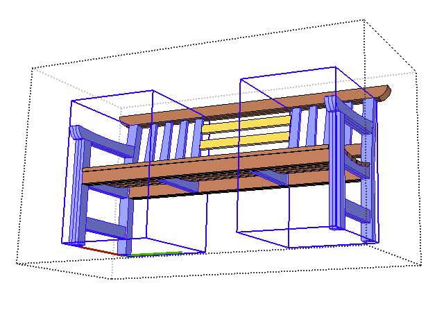
In the bench example shown here, the left hand image shows a ‘working model.’ The component is structured to take advantage of mirrored halves of the bench. A change to one happens to the other. The brown slats are another group for modeling, and the yellow slats are simple independent components.
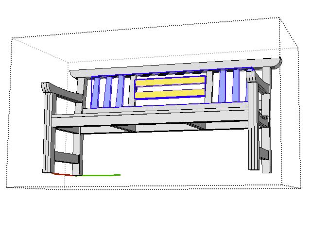
The right hand image represents an ‘upload-ready' component for the 3D Warehouse. It has been restructured. All objects are groups or components. All white objects are the default color and will become the color painted on the bench. The back slats have been organized to allow a designer to quickly paint them with accent colors. They are at the upper level of the outer bench wrapper, so they can be selected or painted immediately upon component editing.
Working with geometry from CAD files
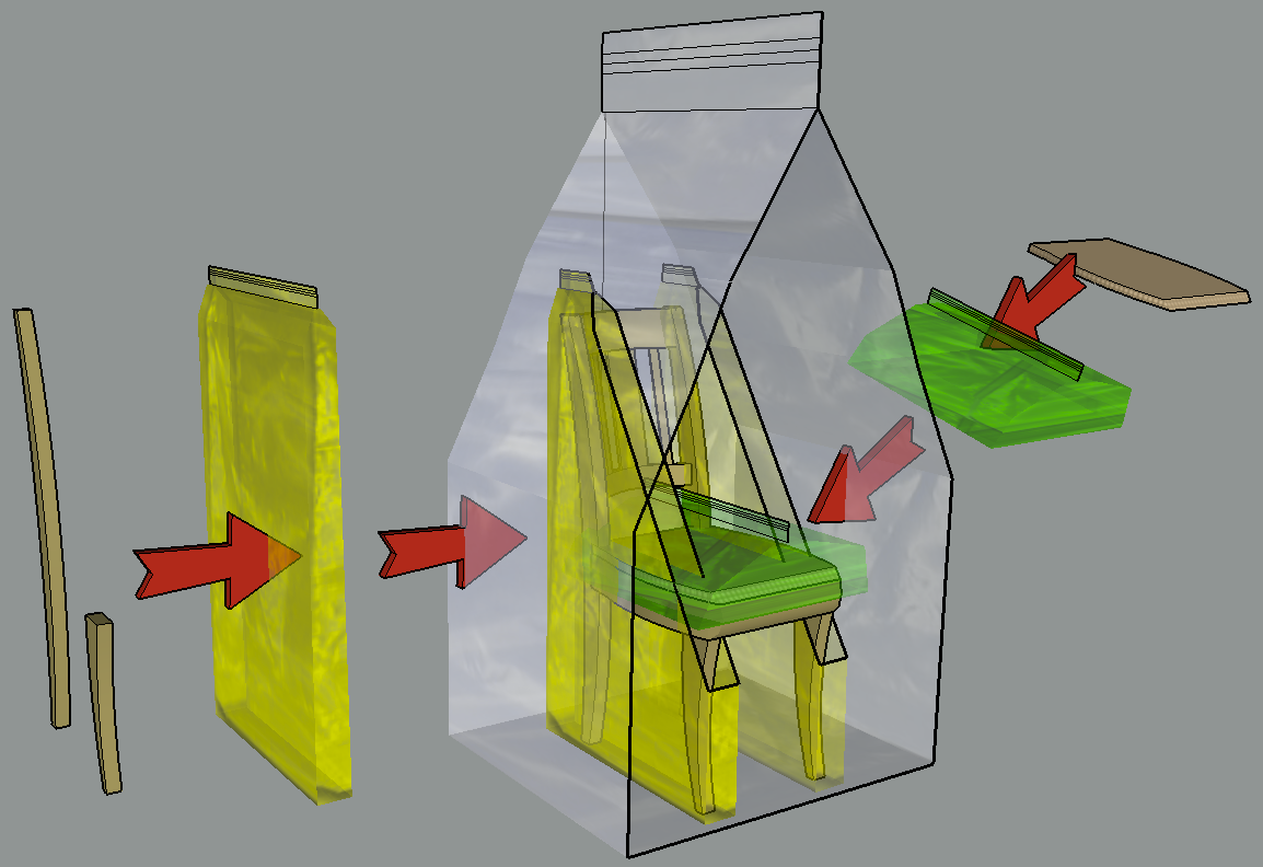
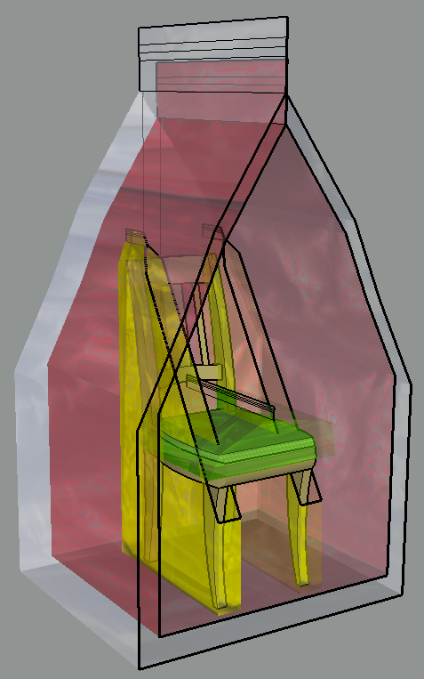
Components and groups can be understood as ‘containers’ or ‘wrappers’ that organize and hold geometry. Components and groups in SketchUp may be nested within other components and groups. The outermost level of a component is sometimes referred to as the ‘outer wrapper.’ In this example of a chair, the legs are put into a component, then mirrored as a copy. The seat is put into a group. Then all the geometry including the back of the chair is put into an overall component named chair. This is component nesting, one wrapper inside another.
Many types of content require multiple levels of component nesting while developing the component, especially for manufacturing. But these are not needed by an end user of a component. It is best practice to simplify this nesting prior to sending the content to 3D Warehouse. It is important to remember that the designer using your 3D Warehouse content does not want to manufacture your product, they want to use your product (place, rotate, paint) in a larger model.
There is a particular issue with many CAD generated models. These models created in CAD systems use hierarchical levels, called families or bodies, that are linked to each other, allowing the design process to be parametric for parts that rely on other parts for size and location in space. When imported, however, each of these levels becomes a group or component within SketchUp. Some of these levels that were used for parametric linking, come across as empty groups and components. That is, they contained information but not geometry. But to SketchUp, these outer wrappers are unnecessary and come in as empty levels, simply containing the next level down, without any geometry at the current level. These are referred to as “empty wrappers.”
In this illustration the outer white wrapper is not needed. Imagine if multiple subcomponents in a file each had empty outer wrappers, this adds unnecessary complexity to the model. If you are working from an imported CAD file, you should check whether you need to simplify the CAD input by simplifying nesting levels or, preferably, to remodel over the CAD geometry. It is best practice to eliminate empty wrappers (empty component levels).
The SketchUp Outliner is a great tool for restructuring a model quickly. The Outliner and the drawing window are linked, such that activity in one is expressed in the other. That is, selecting a component name in the model drawing window selects that very same component in the Outliner. Double-clicking on a component or group in the Outliner opens that very same component or group in the drawing window for editing.
The Outliner shows the name of groups and components at each level of the model. Components are represented by four tightly packed squares. Components are listed by their definition name or an instance name. Groups are represented by a single solid square, and are listed as ‘Group’ by default, or by their name if one has been given.
The Outliner may be expanded for any or all components and groups. When you expand a component or group using the drop down triangle, the nesting levels within that item are revealed. Since groups and components may be nested in any arrangement, the branching within CAD input can be very complicated and not seem logical for the SketchUp world. For this reason, we recommend that you restructure the main component and flatten the nesting of subcomponents to the minimum number that makes sense.
Dragging a group or component up the levels in the Outliner to just under the main component heading quickly restructures the sub-components inside a component. If this leaves the level (from which you moved the component) empty, the empty wrapper level is discarded.
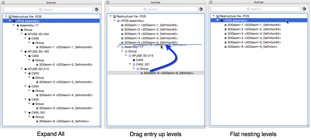
An alternative method is to open the main group or component, and Explode the nested contents. Each Explode operation moves the contents up one level.
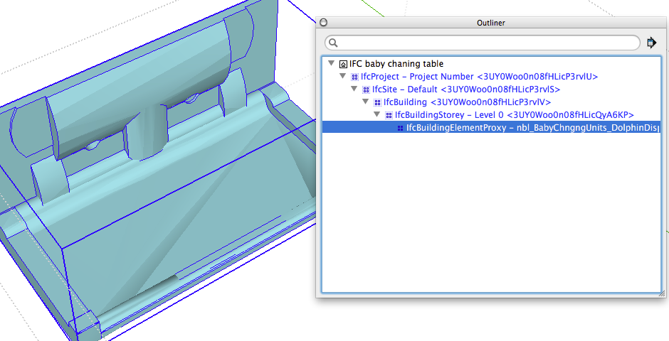
Many models coming from IFC files exhibit similar empty wrapper structure, based upon the IFC information levels. Sketchup content doesn't need to know what Project, Site, Building, nor Storey this baby changing table is within. The content should just be a changing table.
Lastly, it is best practice to give your components and sub-components meaningful names. This enables a user of your content to more quickly understand how to manipulate the color and orientation of parts within your product models.