Making a detailed model in a lightweight way
Table of Contents
Introduction
The level of detail in SketchUp models refers to the complexity (materials, nesting levels) and number of polygons used to represent geometry.
LOD and versions
Some manufacturers might benefit from providing two versions of their products, with a low and a high level of detail. High level of detail models are sometimes requested by designers wanting to produce high resolution renderings of their designs. The additional number of polygons can give better resolution to ray-traced images, but these extra polygons will cripple the efficient working of the overall model.
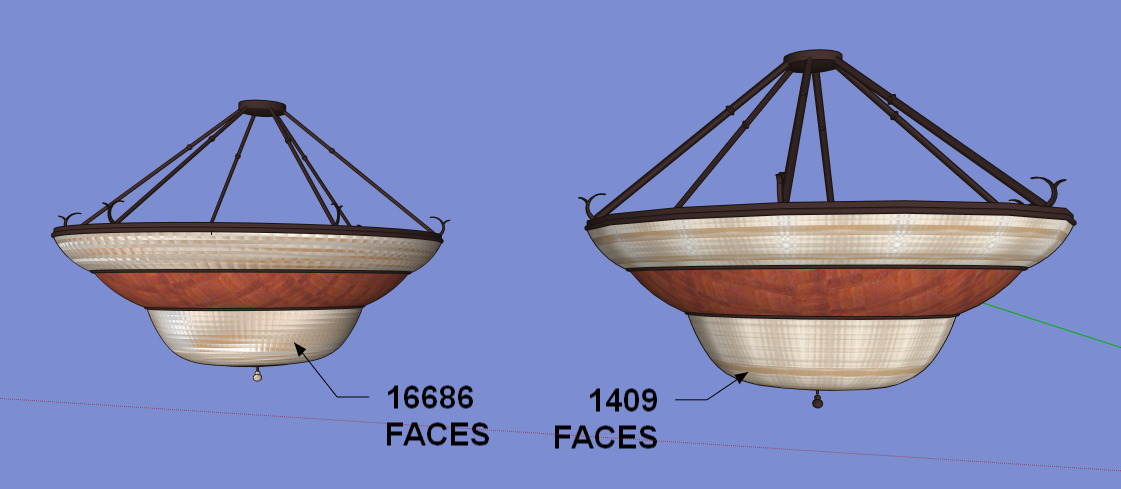
For this simple hanging light fixture, low poly versions of the fixture work well when laying out the design and playing with arrangements. Then when the designer wants to produce a walk through animation for the client, the higher polygon version can be re-loaded into the model.

Note, even here, there is very little difference between the 1409 version and the 288 poly version, and the latter may be just fine for the entire design process. Refer to the article Working with components in SketchUp for more information on reloading components.
Reducing polygon count
Polygon count mattersMany products are modeled using engineering CAD programs to allow the models to drive the manufacturing process and machinery. To do this, a great deal of detail is required of the CAD models. When these types of models are brought directly into SketchUp, however, they can immediately bog down the performance of the model, and many times will hamper the usefulness of the larger context model.
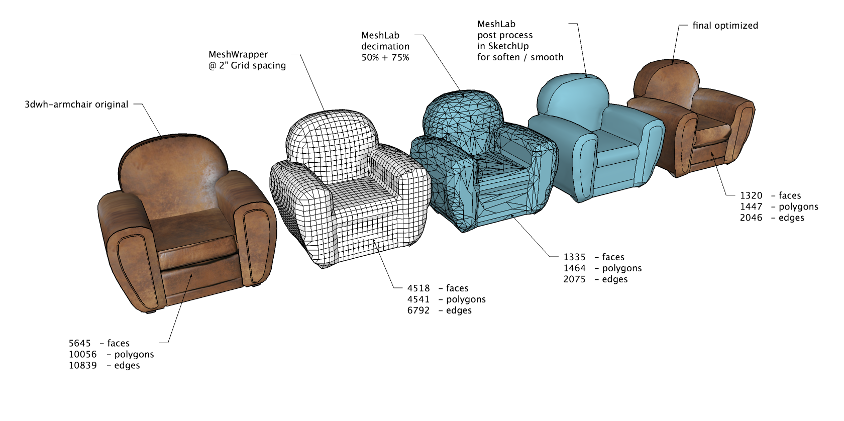
Product manufacturers, in general, should model for visualization, design, or specifying not for manufacturing. A great SketchUp product model is one that performs well in the context of a larger model (a building, a park, a floor plan etc). Typically they are used to flesh out larger works, not as standalone models.
Object standards vary, but all include information content that defines the product:
model geometry representing the product’s physical dimensions, visualisation data giving the object a recognizable appearance, and behavioral data such as detection, maintenance and clearance zones, that enable the object to be positioned in the same manner as the product itself.
Product manufacturers are tempted to simply import their existing CAD files into SketchUp and then post them directly to 3D Warehouse, hoping to leverage their existing 3D content. Nothing could be further from good practice. For more information on preparing engineering CAD files for import into SketchUp and a discussion on polygon heavy files, please refer to the article: How to model efficiently using existing 2D and 3D sources.
As a general rule, never use CAD linework as your source geometry. Do model over CAD linework. The CAD lines can be a framework over which to model, with SketchUp inferring to points in the CAD geometry. One handy tool for reducing polygon count is the MeshWrapper, which was used on the chair example just mentioned. Another is Curviloft or here and here.
Reduce polygon count using smoothed edges|
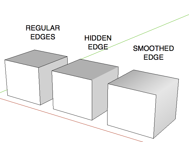
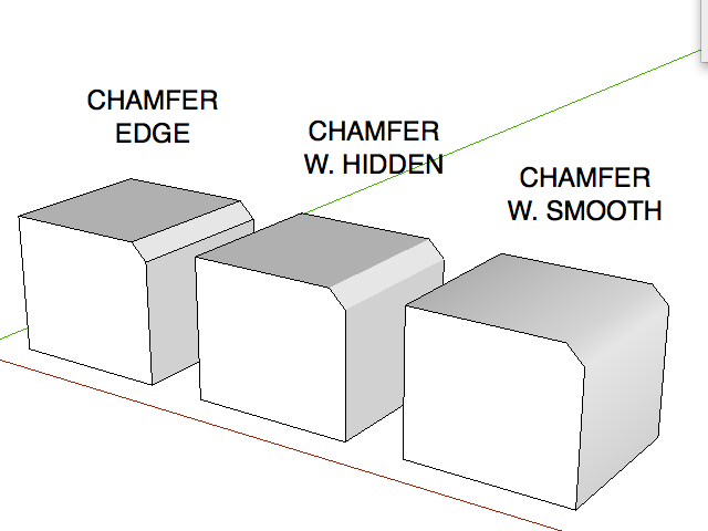
There are several methods for modeling over geometry. These are covered elsewhere for step by step instruction, but we will touch on some of the concepts here. Many times the cause of ‘polygon creep’ (putting too much detail in a model) is due to modeling eased edges. In engineering CAD it is critical to chamfer and round edges of materials with thickness to accurately convey how the product is to be manufactured. SketchUp is able to represent segmented corners as ‘smooth’ by softening and smoothing the edges shared between faces. This allows the modeler to represent eased edges and radius fillets between faces with far fewer polygons and still achieve the same visual result. Consider this image showing a simple chamfered edge. Smoothing the intermediate edges gives the appearance of a round edge using only two intermediate edges. |
|
The radius of a curve specifies the size of the curve, the segmentation of a curve specifies its smoothness, and the faceting of a surface specifies the polygon count that is created by the extrusion of that segmentation.
When to use hidden instead of smooth edges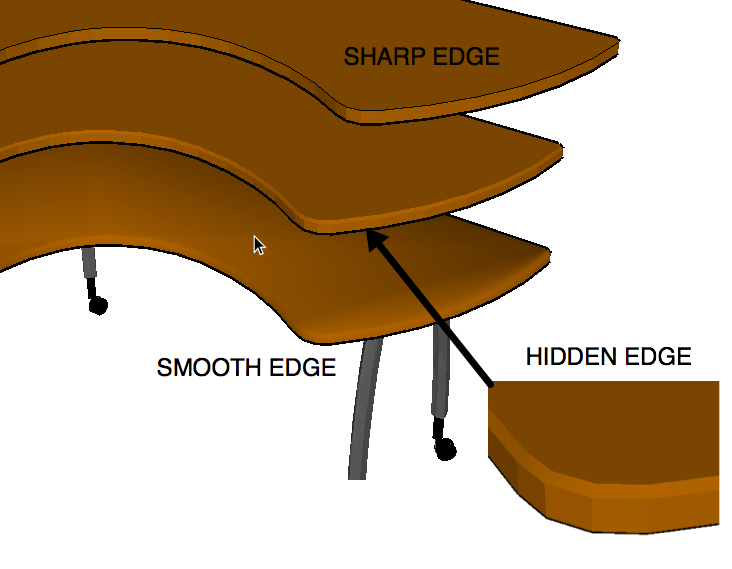 For flatwork like counter tops, an eased edge can be shown using hidden edges and the result reads well for normal SketchUp rendering. Using smoothing on an edge like this destroys the look of a crisp horizontal surface separate from the vertical surfaces. In cases like this, treating the edge with a segmented radius and multiple faces would simply add polygons needlessly to the file.
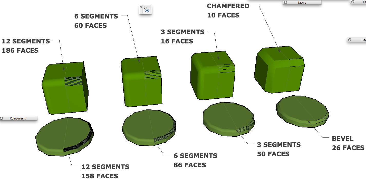
When a round corner or edge is needed, the number of segments should be considered carefully. Over segmentation can affect the faceting (file polygon count) significantly, for very little return on the quality of the SketchUp model. In general, use two segments for eased and chamfered edges, three segments for a small to moderate radius, and 6-12 segments for a large radius.
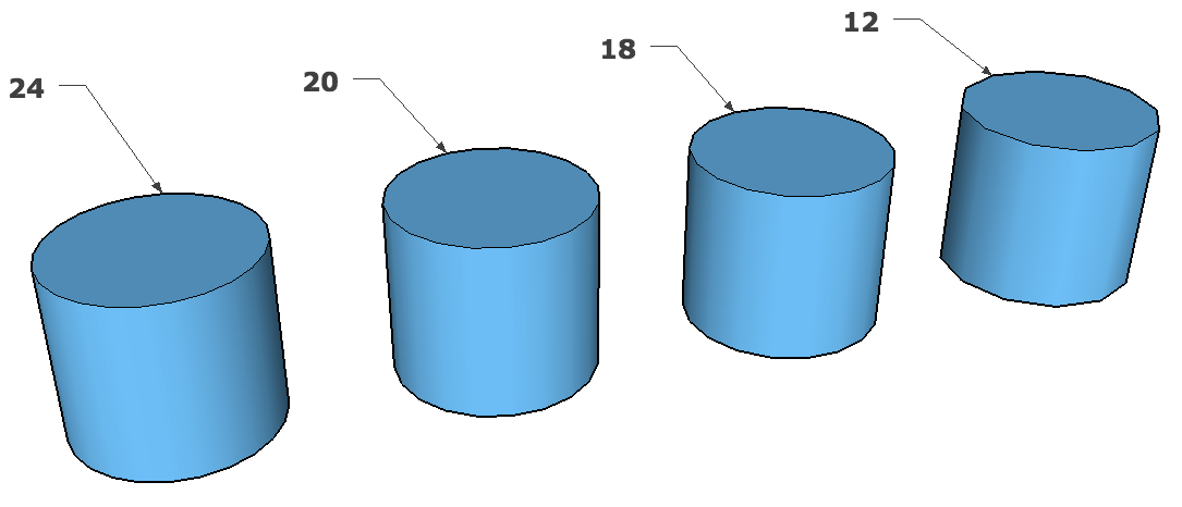
In the cylinders shown here, there is very little to be gained in model quality using more than 18 segments.
Engineering CAD users have never worried about this issue because they are using true arcs which are regenerated for the computer screen depending on the magnification of the model. When the 3D information is used for machining, the CNC code is generated based upon the resolution of the equipment involved. In SketchUp, none of this manufacturing detail matters to a designer. All they want from a piece of content from 3D Warehouse is a spatially correct representation of the object with pleasant smoothness and faceting, and as few polygons as possible.
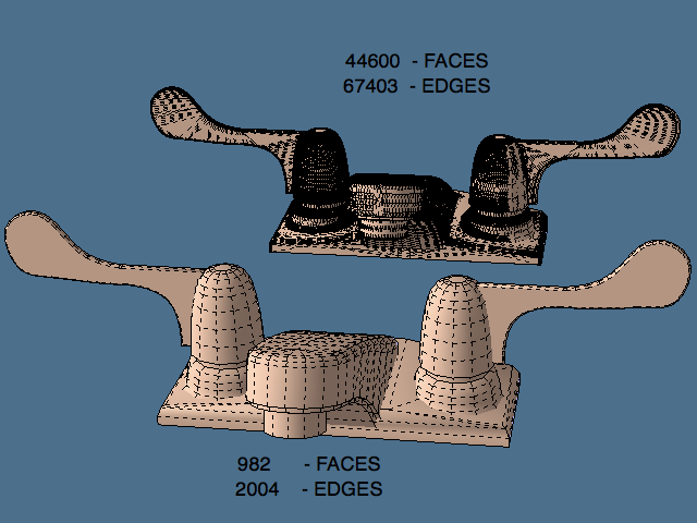 |
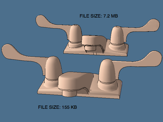 |
Reducing model complexity
Materials and Image texturesThe clarity of a picture varies on the distance it is from the viewer. So to in SketchUp, especially as it relates to painting textures and images upon a 3D model. Using a photograph applied to a model can often communicate better information than very precise geometric modeling. The pixel resolution of an image file used as a SketchUp texture does not have to be as dense as you would need if you wanted a print of that same image. Modelers often think that if a little is good, more is better, but the added file size required to save a high resolution image versus a down sampled image can be significant, especially when several objects are painted this way. Remember the scale of the object and the intended use of the object and size your images accordingly. A vase on a table seen as part of entourage for a dining area is quite different than a single table setting.
Reduce the image resolutionIn general, most product type models can limit their textures to 600x800 pixel resolution at the high end. Again, consider the intended use and work backwards from there. For example, if we want to show a faucet as part of a typical kitchen counter scene, the original 600 x 600 pixel texture will be applied to a faucet, then that faucet is placed on a countertop, and cabinets and windows are placed around it and composed to be printed out at 8-½” by 11”. The actual printed size of the faucet on the paper will be perhaps one quarter inch. This means that at 300 dpi resolution, the faucet will need to be at .25 x 300 = 75 pixels. So the original 600 dpi texture is only being 12% utilized (75 / 600).
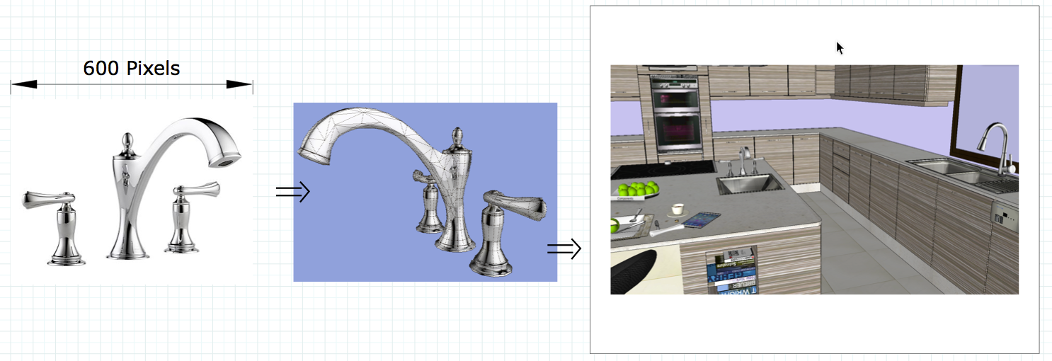
A little photo texture goes a long way. Photo textures add a sense of reality to a model and when used correctly, communicate much more about the product than modeling alone can achieve.
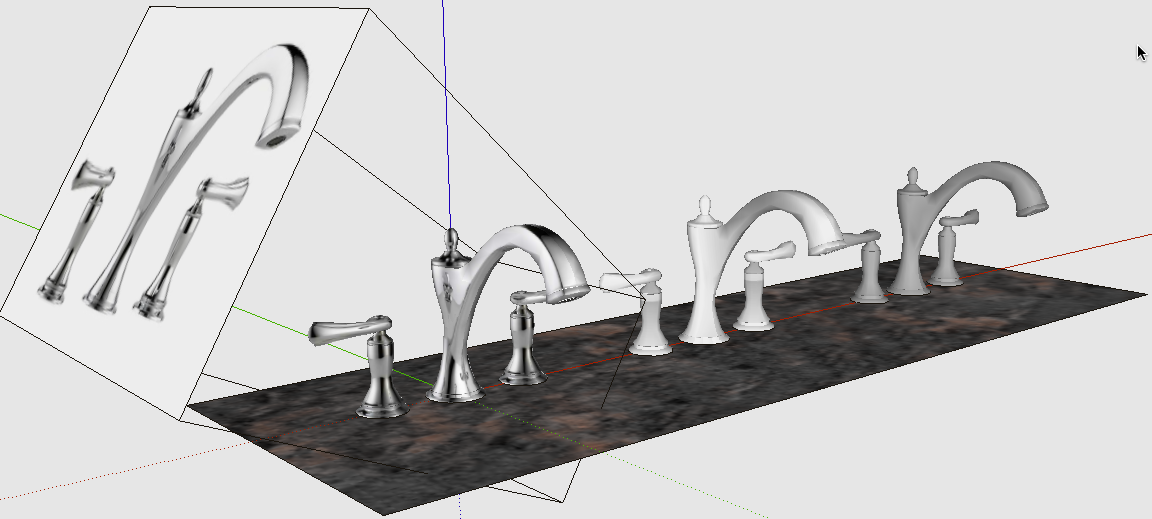 Minimize the nesting of components and groups
Models on the 3D Warehouse are usually only part of a larger design. This means that designers downloading your file will be placing it in their design and possibly painting it to suit their needs. The best practice is to keep component nesting in your 3D Warehouse content to a minimum. The general rule is to model efficiently (using components, mirrored components, fixed materials, etc) and keep things that need user interaction (painting, positioning, etc) at the highest level possible within your model hierarchy. Items that have a standard or fixed color or material can be at any level desired, but things that will require the designer to change, should require as few mouse clicks as practical when editing the component. Please see the article Working with components for a detailed discussion of these concepts.
Keep in mind that the designer using 3D Warehouse content does not want to model the object, they just want to use the object (place, rotate, paint). A good workflow is to have a development folder for ‘modeling’ and a ‘content’ folder for 3D Warehouse upload. This way you can use good practices of model organization (leverage components) while building the model. Then reorganize the model into a content file that is useful to other people as a component in their design. Remember to Save your original construction model for future revisions or versioning.
